Thursday, May 28, 2015

Music Videos Rock!


         We are now more than 100% done with our music video. I think that the costumes added a great touch to everything. I'm pretty sure that people will be able to understand our music video much easier now. My teammates have contributed so much. Especially Ana she was the one that came up with the idea of us to change into costumes rather than just keep on filming in our school uniforms. Kiara also contributed money for the supplies we needed to get costumes and make us the way we needed to look. Rafael contributed a lot of supplies as well that we needed.
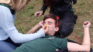
         I think that our audience will enjoy the humor parts of our music video. Kiara and Rafael make it extremely funny with their many different facial expressions. Yep, it was proved, they loved the humor part the most. Another part they liked I believe is all of our different costumes that we added in. Especially Rafael with his devil outfit.
          I think our music video shows a lot about what we learned this year. For one, how to make great quality work. The music videos also shows our talent in imovie and our use of transitions and video effects that we added in to our music video. I think that this is a great way to end the year in G.T. This has been an amazing project.


Tuesday, May 12, 2015

Lyrical Livelihood

The people in my team are Rafael Sifuentes, Kiara Wetherington, and Ana Ell. My favorite song at the moment I guess would be "I Constantly Thank God For Esteban" by Panic At The Disco. I really enjoy all of this band's songs. This song makes me feel I don't really know, happy and full of energy would be a way to say it. When I listen do my favorite artist or band I feel like I could do a lot like I'm empowered.

 My team chose "Ramble On" by Led Zeppelin. We chose this song because we really liked the artist and we thought that it would be a very creative song to do. It also has a great beat and rhythm. We did have a lot of other choices for the music video but most of them were either not school appropriate or everyone didn't agree on it.

Our music video is going to tell the visual story that we thought  the song meant. We think that this song talks a lot about heart break and finding your true mate, or around those lines. So I am going to sort of be the main character that gets cheated on by Kiara who is the cheater/evil one. Kiara cheats one me with Rafael. In the middle of our film session on Thursday we realized that people will have a hard time trying to understand what the story is about. So we got some costumes made Kiara and Raf look relatively evil and me and Ana kind and good hearted.

Monday, April 27, 2015

Our Animation Story


Or focus statement is "Kiara receives party".  Kiara's story was her last day at her old school in North Carolina. On that day her advisory teacher and all of her friends threw her a surprise goodbye party with all of her favorite drinks and food. I think our focus statement tells our story very simply, it pretty much sums the entire thing up.

I think this story has many valuable life lessons, but I think the most biggest and most important one in my own opinion is to always do the best that you can to make someone have the best time they could possibly have. Her friends and teacher could have done barely anything, but no they threw her a whole entire party for her. A surprise party. Just by doing that they made that memory an actual memory that she would remember for hopefully the rest of her life. So in my opinion making a memory last for someone is what I think the audience will learn after this.

Okay I'm pretty sure that I take the placeholder for my team's worst moment. We were doing the wide for scene two in Stop-Motion and I could not get the camera to focus at all. No matter what I did I tried I couldn't get it to focus. Turns out I had it on manual focus. Yep I was feeling great. Now I think that Rafael takes placeholder for our teams best moment. He completed the close for scene four, the beautiful car, during the critique. Finishing that scene gave us the twenty four seconds that we needed to get that requirement checked off. I really enjoyed this project and can't wait for the next one!


Wednesday, April 22, 2015

Animation Outtakes

My team for this project includes, The talented Iris Murakami, The brilliant Kiara Wetherington, and the skilled Rafael Sifuentes. Two interesting facts about Iris is that she is a twin and she like anime. Two interesting facts about Kiara is that she has been to acting school for two years and she loves to sing. An interesting fact about Rafael is that he is an extraordinary debater and plays the guitar.

Stop-Motion animation is a type of animation technique used to manipulate an object or person to make it seem like it moves on it's own. In my animation project we used stop-motion for two scenes. In these two scenes I manipulated Kiara and Rafael walking with style throughout the school, handing papers to each other, and opening doors. A .GIF is a multitude of different clips merged together and played on a continuous loop. I have created two .GIF animation examples.

For my team's project idea we went with Kiara's. Kiara's memorable moment was when she was switching schools, and on her last day of school her friends and teachers threw her a surprise party with all of Kiara's favorite food and drinks. I think you should care because this is an amazing thing to do as a friend, if I were in Kiara's shoes at the time I would have felt just so happy and full of joy because she knew that her friends cared for her. Also it's just pretty interesting.


Thursday, March 12, 2015

Typography Images

 Typography is the art of arranging text in an image to create an image that has an emotional effect on the viewer. Filling in an image in with inspirational or motivational words can have a lasting impact to them. Sometimes these words are used to describe the subject in the image or just a famous phrase or saying.

I think that the biggest challenge during the innovator project was getting all of my layers in the correct order. Also I got very confused with all of the keyboard commands when first learning them. I really enjoyed doing the teacher typography project. I did hit some bumbs along my way as getting my text to show through my final image also getting my brightness and contrast to even out. I had a ton of highlights in my image and not enough shadows. That created the problem with my text. Thanks to some friends that taught me that I could easily bring out my subject's features by going over the eyes and lips with the text tool. With my final typography portrait I had a problem with getting the right amount of black, grey, and white to show in my photo when I posterized it because I had maybe when tiny spot of highlights.

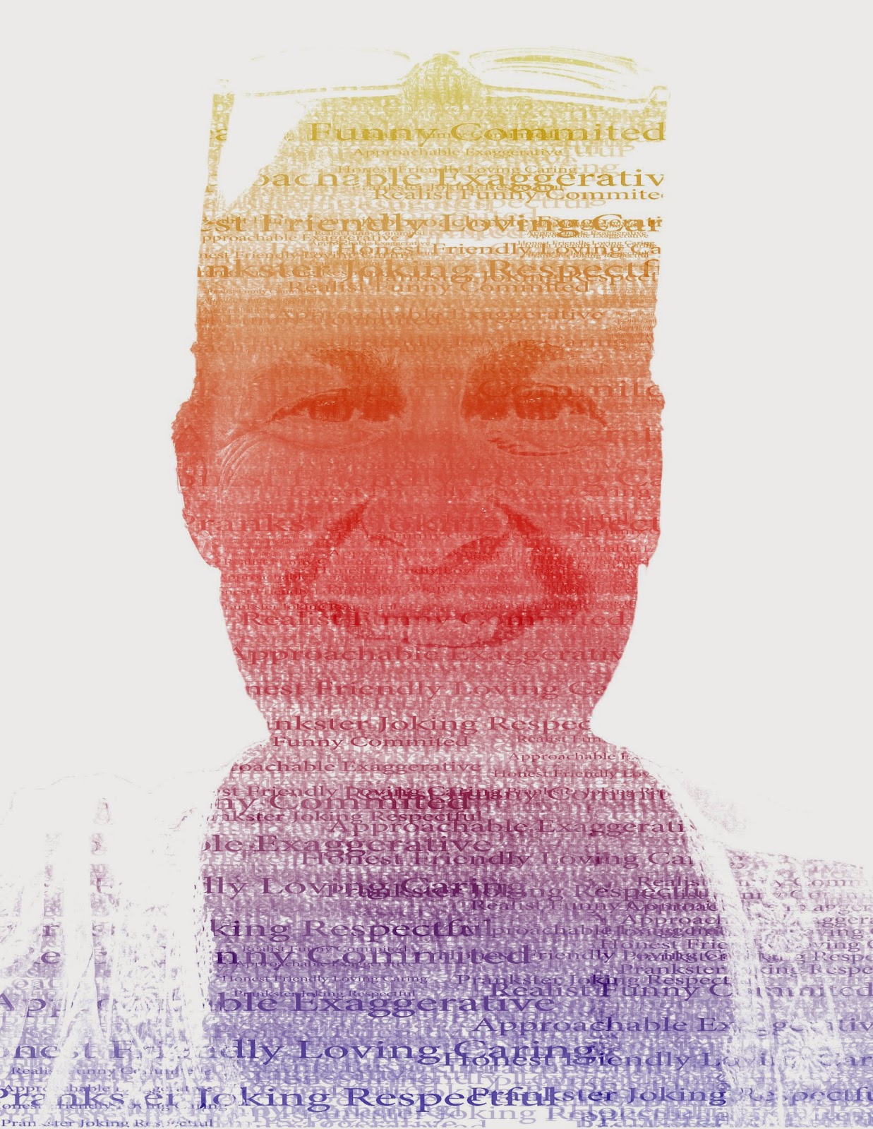
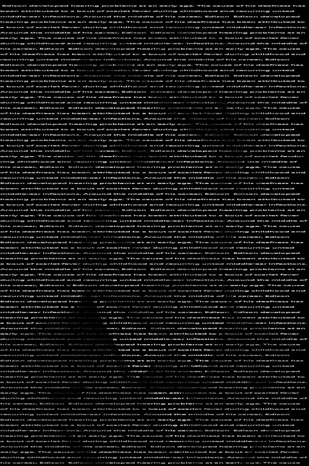
My innovater typograhy portrait is a picture of Thomas Edison covered in very small text describing him. My teacher portrait is a picture of my sixth period science teacher, Ms. Bandsma covered ibln text that describes her. She has been my teacher twice in seventh grade and now once more in eighth. I chose her to do my teacher portrait with because she is the teacher that I know the most. My "Me" portrait is a picture of myself covered in text that describes me. They were all made using different steps and methods. For my innovator portrait I first started out by cropping the image around Thomas Edison's face, then I created a new layer and filled that layer with black. Then I chose my font and text and started to add my chosen text to the image. After I have completed that I added a layer mask to my text layer. Then I copyed the backround layer and pasted it directly on to the layer mask. After I had completed that I just duplicated my text layer to make my image brighter.

My teacher portrait was done differently and was the most fun to do in my opinoun. First I started out with a picture of my teacher and used the quick selection tool to cut out her face and then refined the edges a bit. Then I made a new layer and filled it with white so that I would have a white backround. Then I went ahead and selected all of the shadows in the image, Select/Color Range/Shadows. Then I copyed the shadows and then created a new layer with them. then I did the exact same thing for the midtones. Then I turned my backround layer off so that just the highlights and midtones were showing. Then I filled my highlights layer with 50% grey and my midtones with black. Then I merged the two layers together. Now I created a new blank layer and filled it with white. After I did that I crreated the text brush that I will use later on for the image. The words that I used in my brush were words that described my teacher. After I finished putting all of my words on to my text layer I used the  rectangular marquee tool to select the area around my text then I went to edit then define brush preset and created my brush. Then I made two new blank layers and filled the first new layer with white, and hid that. Then I went back to my backround layer and copyed the entire thing; then I went to the second new layer and selected my text and chose a black text color and started stamping my text over my image making sure to change the size of the brush every so often. After I finished placing my text I place a layer mask on layer three, then I held down alt on the layer mask to make sure I was working on it then pushed Ctrl and V, Ctrl and D, then Ctrl and I. Now after I finished that I went back to the image I was working on before and turned off the layers that I merged together. Then I turned on layer 2 so that it would make it brighter. For the last step I added a gradient overlay to get some color. This was my favorite typography image.
were words that described my teacher.
Innovator
For my final typography image the first step was to crop my image. Then I used the quick selection tool to cut away the backround. I unlocked the backround layer and renamed that layer "Portrait" then I made a new layer and filled it with white so I would have a white backround and moved that layer to the bottom. Then I went to Image/Adjustments/Posterize and set the level to four. Then I created the text brushes the same way I did with my teacher portrait but this time using words that describe me. Using the rectangular marquee tool I selected the black in my image then went to Select/ Similar. I then made a new layer and filled that layer with the words that represents me, I did the same for the light gray, dark grey, and white. After I placed all of my text in the right spot and size I added a gradient layer for some color.
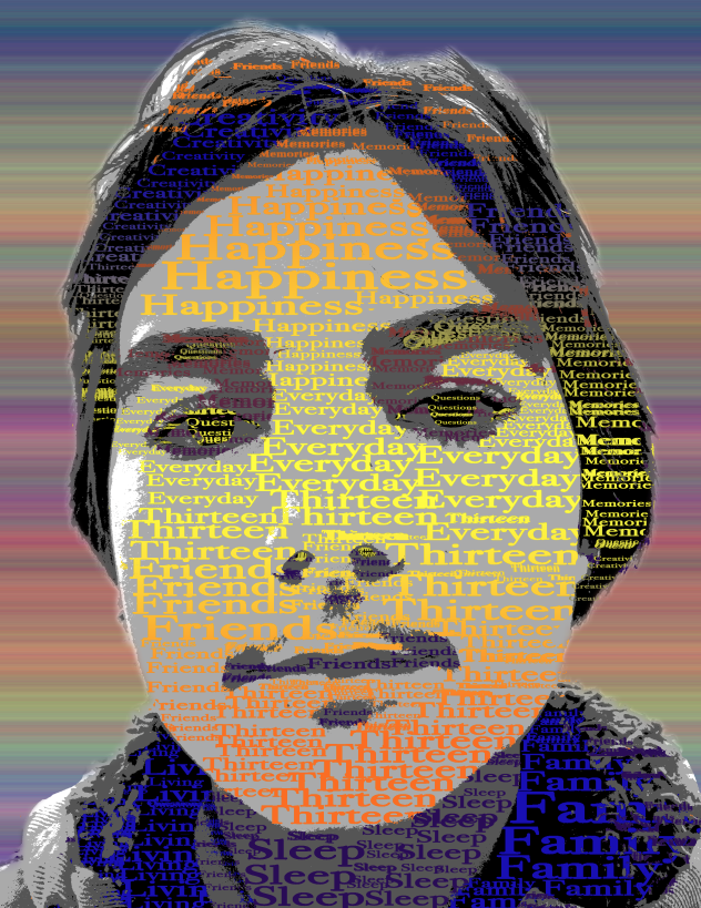
Final Me Typography
Teacher

Tuesday, February 24, 2015

Double Exposed Portraits

Portrait photography is a picture of a person that captures both eyes and usually all of there face. Portrait photography can relate to profile view because you are still getting half of the person's face compared to the whole face in the picture. Portrait photography can relate to silhouetting because when you take a silhouette of someone or something, their face or body is usually completely darkened or black against something bright like a sunrise or something else.

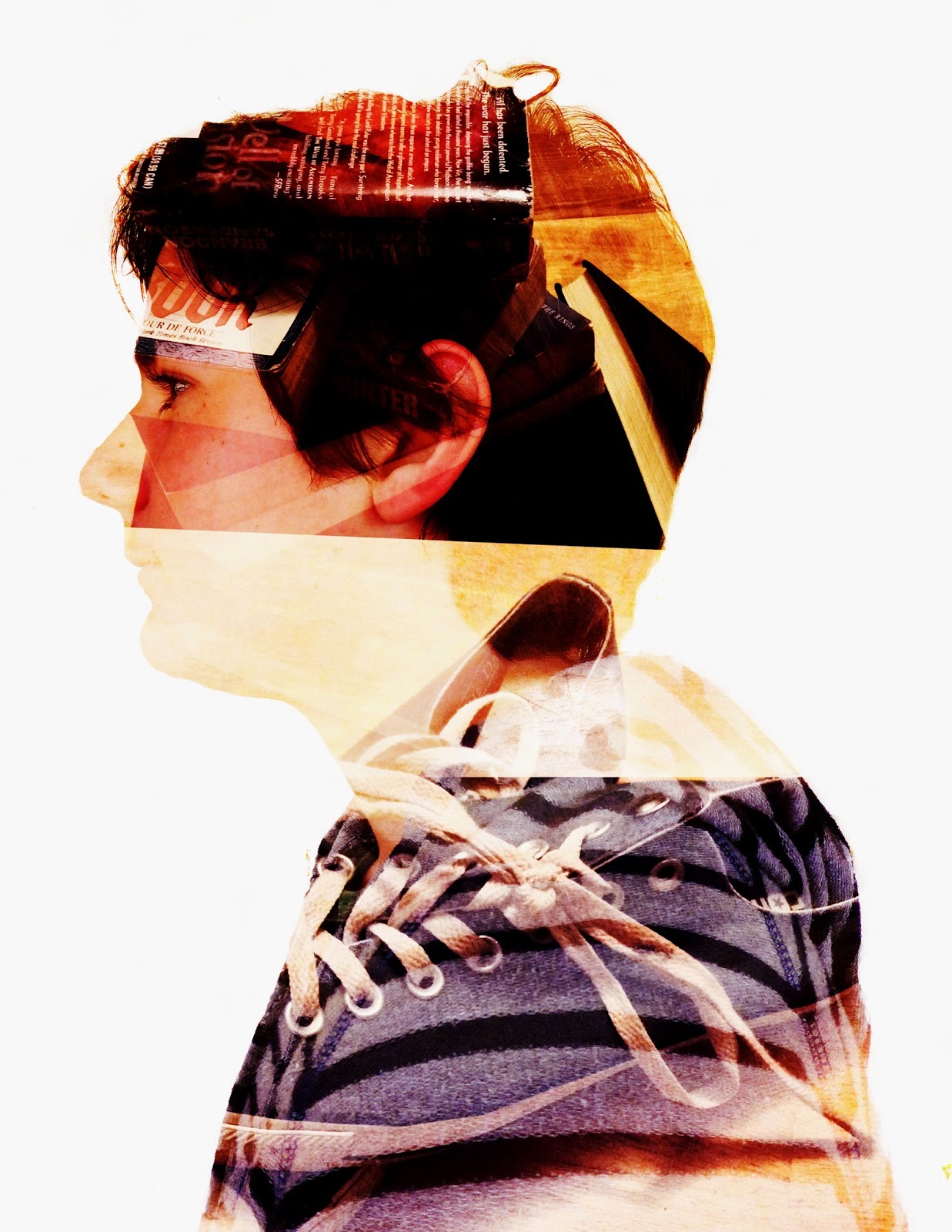
To create a double exposure image in photoshop you first have to go to, File = Scripts = Load Files into Stack. When you get all of your files loaded you want to use the dodge tool and make the entire space around your portrait white. Once you have gotten your background white you want to crop and resize your photo to 8.5 by 11. After you finish resizing your picture you want to double click your layers and go to the blend mode option and select screen. Now you can adjust your pictures move them around a little, add some adjustment layers and explore the different options photoshop provides for you.

The two pictures that I used in my portrait was a picture of some of my favorite favorite books. I added that picture in to symbolize how much I love to read and write. The next picture that I added into my portrait was a picture of my shoes. A lot of people know that I love the Coverse brand and shoes all together. The adjustment layers that I added to my photo were, Curves, Vibrance, Color Balance, and Exposure. I think that I could have increased the quality of my work by just cleaning up all of the marks by the edges of my photo. This project was very fun and I'm glad that we got assigned this project.


Monday, February 9, 2015

HDR Photography

HDR photography is a method of photography used to add more High Dynamic Range to photos. HDR is the ratio of light to dark. HDR is used in photos to increase the Dynamic Range shown in photos. I really like using HDR in my photos because, I like how it adds so much color and vibrance and can turn a sort of dull and boring picture of a landscape into something with so much color and vibrance. But sometimes it can look sort of fake or to real.

When you have finished taking your seven different exposure level photos, they are ready to be put into photoshop. First you open File, then Automate, then select Merge to HDR pro. Browse for your seven different pictures and open them up, and then sit back and watch as Photoshop merges the seven different pictures to create a final HDR image. Then you can choose and test all of the different settings. Increase the gamma and exposure or turn down the saturation and vibrance. Then you're all done. This process is very different from automatic HDR functions like phone cameras.  They differ from each other each other each other each other each other HDR method combines all of the different exposure levels into a beautiful picture.

My thought process for my landscape was to get a different angle on the mountain. I could have improved this picture by a lot if I had moved the horizon line up so that less of the dark sky would show and more foreground would be there. My thought process behind of my portrait wasn't really there. A lot of things can be improved about this picture. For one, the rule of thirds, I could have moved her to the right more so that she would be lined up. Also It's out of focus, which could have easily been fixed. Surrealism isn't there.

Tuesday, January 20, 2015

Movie Trailer Critique


Our new project was very fun, it was a new experience for me. Me and my team had to create a movie trailer, which was a huge part of my and my teams grade. We also made a movie poster to go along with our movie trailer, which was a big part of our grade as well. My team consisted of myself, Maya Clark, Seth Kostelecky and Kaylynn Drake. Both me and Maya were actors in our trailer. Seth and Kaylynn did a lot of camera work and helped with the posters. We had a Trailer Plan where we organized all five scenes and wrote the voiceovers and dialogue, and the movie trailer synopsis.

The project requirements that we needed to include were voiceovers, voice acting scripts, dialogue, and text layovers. It needed to be between one minute and thirty seconds and two minutes. Also it needed foley, special effects, and our completed movie poster. I think that we got all of the requirements. The foley that we created was the sound of a backpack dropping on the ground, and the sound of footsteps going up stairs.

I put our team evaluation picture by the bottom. We got the most points in satisfactory and an average amount in room for improvement. We got the least points for above & beyond. Yes I agree with the statistics that my classmates gave my team. I think that we could have added a little more detail to the overall story. This project was extremely fun and educational, I learned a bunch more techniques using the camera, and how to do certain things in Final Cut.


Monday, December 15, 2014

Movie Poster Promo

The main character in our movie poster is a girl named Alex. Her friend Jean is not in the poster but is in the trailer itself. She is standing by the water looking out at the waves. With a board in hand, she starts heading into the water.

The movie title is called, "Getting over it". We named our movie trailer that because of how Alex gets through her problems and overcomes her fears of the ocean. The poster also shows the list of all the actors names and different reviews by different companies and businesses.  The rating is also on the movie poster, which is "G". Kerning is about adjusting the letters size and spacing, so that it makes the letters look like there popping off the page. Using kerning will add a nice look to the letters which in my opinion will improve the overall movie poster.

The overall impact that all of the layer effects and filters that I added created a nice touch to it. If I hadn't added those different effects I think that it would look really plain and bland. The effects make it look really unique and different. I think my final movie poster image is alright.
Final Movie Poster

Wednesday, November 26, 2014

Proactive or Protacrastation?

When it comes to projects with like a two week long due date, I would procrastinate till the week before the due date. But when the due date is two days from now I would usually just get it down really fast and complete the assignment. But sometimes it's completely different. I don't know if I'm a procrastinator or a proactive person. I think I am right in the middle between the two.

The level of my productivity does relate to my amount of free time. If I get the project down in a day and not wait till the last moment I will have more free time on the weekends or after school to do the things that I would like to do. I try hard to get most of all of my school work done in school so I won't have any homework later on that evening.

I think I would change my work habits in a way so that I want to complete my assignments as soon as possible and stop procrastinating. I think that this will help by allowing me much more free time and not having to worry about the deadline or trying to finish the assignment on time. This will allow me to do more things that I want to do. For the, Movie trailer project I will try not to be a procrastinator and be more of a proactive person and all the projects in the future.

Thursday, November 20, 2014

Visual Literacy

In my period 7 class we got assigned a new project, Book folding! We had to fold each page of the book to form a word that we chose. The word was usually between two and four letters long. The word that I chose was time! I procrastinated for like a week, but then got it done in a couple of days. This type of book folding was developed by a man named Isaac Salazar. Isaac is an book artist. He makes use of books that would be burned our thrown away, and creates them into amazing pieces of art. What is visual literacy? Visual literacy is the ability to interpret and understand the meaning of art in the form of an image. This project is an example of visual literacy because it is literally visual art.

The book that I did was a World Book. It had around nine hundred pages. My word, time, related to the font that I chose which was Dancing script, which is a type of script, because time is wavy and up and down, just like the script.  . It was fun but also very challenging to fold a book into a word that was in script. This project was very inspiring. I chose this word because of all the time that I put into it. The amount of pages that I folded to make my word was around 600-630 pages.

I really liked how the final product turned out. I think that I would go back and refold some pages to make it a little more neat. If I did this project again I think that I would have chosen the letters "DW" as my next book. I would have chose these two letters because of a love for a certain series. This project was very fun and challenging.

Monday, November 10, 2014

My Visual Poem


This time my project for G.T. was to create a visual poem. A visual poem is a way of writing poetry but using imagery that relates to what is going on with your poem to show the reader/watcher of your visual poem what is kind of going on. My poem was about "Moments". Moments when you read a book, what kind of emotions that you feel when reading. What do you feel when you finish a book? Sad? Angry? Relief? Many emotions that you can feel.

The special effects that I added I think helped with the mood a lot. Like the music and filters that I added into my poem. Also the music helped a lot because it kind of related to what I was talking about. If I did not add effects and music I think that it would be very dull and boring.
I am satisfied with the results. This was the first time that I have ever done something like this, so it was very fun to experience something new. I think that I could have added more effects. I also could have gotten more b-roll and clips. I am glad that we got this assignment, it was really fun. Also I could have gotten my voice over done better and clearer. 

Wednesday, October 29, 2014

Finished News Story


Our story was about "The effects of technology". Our team consisted of myself, Hannah, Sophia, Brandi, and Miles. There were also many others that we interviewed including, teachers, parents and students.  In my own opinion I think that the final after we edited and fixed all of our errors, it came out really good. Yes, I am happy with it. I think that all the people in our team contributed to the story well. Our team got 21% "likes".  We didn't get the best overall story, The Drake Fire Knife Tradition story has that honor. I agree with the results, yes. I think they are pretty accurate. 

Tuesday, October 14, 2014

Real World Report


 The news story that I had decided to do was the one on the people are that got stranded off the coast of a greek island. There were about 345 people including 52 children aboard the ship that had crashed.  They all had to seek medical attention in Cyrus a city in Greek.  Cypriot authorities are trying how to deal and solve this problem.  Vasiliou a reporter, told other reporters on the east Mediterranean main Limassol port.   The authorities still have to figure out what to do with the survivors.
 Thousands of migrants running away from war or fights in the Middle East and northern African towns and cities, in attempt to cross the Mediterranean Sea in rickety old boats in search of safe places in Europe, and many have died trying to accomplish this. The people that were all aboard a small ship that issued a distress call early Thursday because of rough seas and strong winds maybe 50 nautical miles off Cyprus. The Cypriot Defense Ministry said the boat had “most likely” set sail from Syria filled with “civilian refugees.” Vasiliou said his company received the request from Cypriot Search and Rescue authorities to help out in the rescue of the refugees.

But then an unexpected turn of events costed his company “several hundred thousand” euros after the cancellation of a trip, 300, mainly Russian tourists to Haifa, Israel aboard the cruise ship that was scheduled to depart thursday.

This is a very important topic to be dealing with, in my opinion.  We should not be felling threatened to run away and then not having trust in our boats.  We must make sure that we can trust the transportation that we use to get to place to place.


http://www.washingtonpost.com/world/europe/official-boat-with-migrants-spotted-off-cyprus/2014/09/25/56ac6374-448c-11e4-8042-aaff1640082e_story.html

Thursday, September 11, 2014

Lessons Learned

The most interesting part of this assignment was going out and interviewing different people, and learning all the different types of computer and camera functions. We are finishing up with our b-roll sequences. We have also finished transcribing our three interviews that we've done.

We did have a lot of roadblocks, such as getting all of our interviews transcribed on time, getting all the necessary B-roll sequences, I think the most biggest roadblock our team handled was getting to place to place with five people including myself on our team, for interviews with people that are in like, Lihue or, Hanalei, because we all live in different parts on the island, and it's hard for us all to be at a certain place, at a certain time.

I think the most valuable part of the filmmaking process is that we are all able to learn new things and as much as we can about different kinds of styles such as, interviews, different types of techniques, and how to use different types of cameras.


Tuesday, August 26, 2014

Hiki No Behind The Scenes

 "Social media and how technology affects the modern adolescent mind and life style" is the topic of our Hiki no project. It's going well, we have all the papers and we are finishing up our interview data. We now just have to do some editing and transcribing in Final cut pro and we will be mostly caught up.  

We have interviewed two people so far and are interviewing another tomorrow. When the camera isn't rolling we are working on transcribing and working on our video. I can help my team by finding out when the people we are going to interview when they are available to be interviewed by our team, also help by making new interview questions for the people that we are going to interview.


The Experiment

So today in my G.T class we did some "experimenting" on photoshop.  For me it was my first time on photoshop, it took some time to get used to.  Mr.sanderl decided to let us try to create something without him teaching us how to use photoshop.  It proved to be very challenging for me.  But i did manage (with lots of help) to create a final image using photoshop.

Monday, August 25, 2014

Back to School


So I started this blog this year, for G.T.  Being an eighth grader at Kapaa middle school, is fun but also challenging.  Favorite moment and my biggest challenge this school year are both the same event.  This event is when we started doing the Kms news cast in the mornings.  It was both thrilling but also frightening both at the same time.  To be successful this school year I am going to be getting into more social activities such us Kpac, since I would like to improve on my social skills.