I think that the biggest challenge during the innovator project was getting all of my layers in the correct order. Also I got very confused with all of the keyboard commands when first learning them. I really enjoyed doing the teacher typography project. I did hit some bumbs along my way as getting my text to show through my final image also getting my brightness and contrast to even out. I had a ton of highlights in my image and not enough shadows. That created the problem with my text. Thanks to some friends that taught me that I could easily bring out my subject's features by going over the eyes and lips with the text tool. With my final typography portrait I had a problem with getting the right amount of black, grey, and white to show in my photo when I posterized it because I had maybe when tiny spot of highlights.
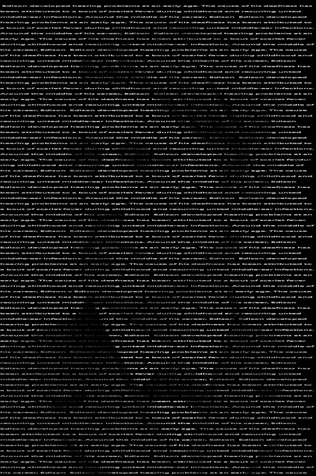
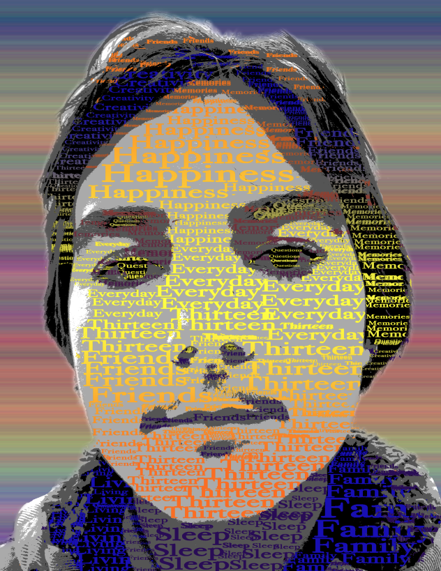
My innovater typograhy portrait is a picture of Thomas Edison covered in very small text describing him. My teacher portrait is a picture of my sixth period science teacher, Ms. Bandsma covered ibln text that describes her. She has been my teacher twice in seventh grade and now once more in eighth. I chose her to do my teacher portrait with because she is the teacher that I know the most. My "Me" portrait is a picture of myself covered in text that describes me. They were all made using different steps and methods. For my innovator portrait I first started out by cropping the image around Thomas Edison's face, then I created a new layer and filled that layer with black. Then I chose my font and text and started to add my chosen text to the image. After I have completed that I added a layer mask to my text layer. Then I copyed the backround layer and pasted it directly on to the layer mask. After I had completed that I just duplicated my text layer to make my image brighter.
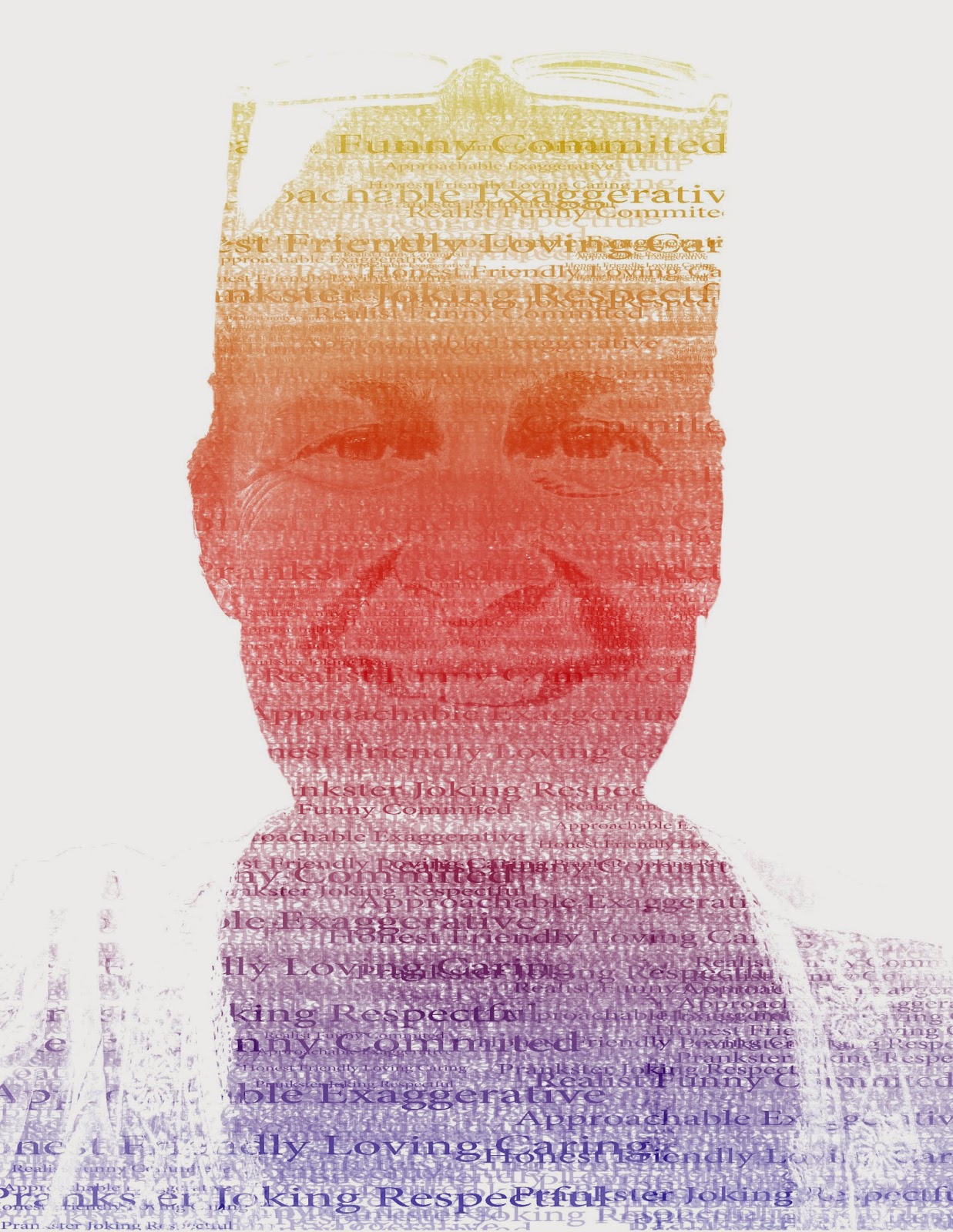
My teacher portrait was done differently and was the most fun to do in my opinoun. First I started out with a picture of my teacher and used the quick selection tool to cut out her face and then refined the edges a bit. Then I made a new layer and filled it with white so that I would have a white backround. Then I went ahead and selected all of the shadows in the image, Select/Color Range/Shadows. Then I copyed the shadows and then created a new layer with them. then I did the exact same thing for the midtones. Then I turned my backround layer off so that just the highlights and midtones were showing. Then I filled my highlights layer with 50% grey and my midtones with black. Then I merged the two layers together. Now I created a new blank layer and filled it with white. After I did that I crreated the text brush that I will use later on for the image. The words that I used in my brush were words that described my teacher. After I finished putting all of my words on to my text layer I used the rectangular marquee tool to select the area around my text then I went to edit then define brush preset and created my brush. Then I made two new blank layers and filled the first new layer with white, and hid that. Then I went back to my backround layer and copyed the entire thing; then I went to the second new layer and selected my text and chose a black text color and started stamping my text over my image making sure to change the size of the brush every so often. After I finished placing my text I place a layer mask on layer three, then I held down alt on the layer mask to make sure I was working on it then pushed Ctrl and V, Ctrl and D, then Ctrl and I. Now after I finished that I went back to the image I was working on before and turned off the layers that I merged together. Then I turned on layer 2 so that it would make it brighter. For the last step I added a gradient overlay to get some color. This was my favorite typography image.
were words that described my teacher.
 |
| Innovator |
 |
| Final Me Typography |
 |
| Teacher |