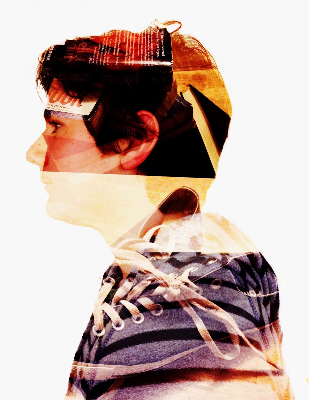
To create a double exposure image in photoshop you first have to go to, File = Scripts = Load Files into Stack. When you get all of your files loaded you want to use the dodge tool and make the entire space around your portrait white. Once you have gotten your background white you want to crop and resize your photo to 8.5 by 11. After you finish resizing your picture you want to double click your layers and go to the blend mode option and select screen. Now you can adjust your pictures move them around a little, add some adjustment layers and explore the different options photoshop provides for you.
The two pictures that I used in my portrait was a picture of some of my favorite favorite books. I added that picture in to symbolize how much I love to read and write. The next picture that I added into my portrait was a picture of my shoes. A lot of people know that I love the Coverse brand and shoes all together. The adjustment layers that I added to my photo were, Curves, Vibrance, Color Balance, and Exposure. I think that I could have increased the quality of my work by just cleaning up all of the marks by the edges of my photo. This project was very fun and I'm glad that we got assigned this project.


I really like your use of negative space. I also really like the layer adjustments you added and the colors of your symbolic images. Awesome work!
ReplyDeleteReally cool symbols and much meaning of them. Good job Aedan!
ReplyDeleteI think the way that your shoes blended your sweater looked nice, but the images were hard to make out with them.
ReplyDeleteThis comment has been removed by the author.
ReplyDeleteI like your image, I can see both symbols well good job!
ReplyDeleteI like how you arranged your shoes and the books, and you can clearly see both of them.
ReplyDeleteGreat job! I really like the brownish, yellowish color scheme! It really makes the whole thing "POP"!
ReplyDeleteI can clearly see your two pictures and I love how your shoes blend in nicely with your jacket. Maybe just show your books more.
ReplyDeleteHey! I love how well blended your photos are. One thing you can improve is the middle part of your photo, it's kind of awkward there. Overall, I really love this photo!
ReplyDeletegreat cut out
ReplyDeletegreat amount of writting
I think the overall placement could have been improved because the books are barely noticeable. I mean, I can see it the books but I want to see more of it. Same goes for the shoes. Though, I really like how the books and the shoes shows who you are.
ReplyDeleteI can easily see your symbols and your image is nice and colorful. Great job Aedan!
ReplyDeleteMy favorite part of your final is that your shoe blends in with your jacket, it looks cool... I can see both of your photos, great job!!
ReplyDeleteHey Aedan, nice final photo. I like how you used the dodge tool to keep the hairs that are standing up. Nice color scheme as well.
ReplyDeleteI like how you placed your images. Your symbols are easy to see and blend well together. Overall, good job!
ReplyDeleteI really like your colors, and I can see your images clearly!
ReplyDeleteI like how everything looks well blended. I think your shoe could stand out a bit more however, since the colors kind of blend into your sweatshirt. I like how you can see both of your symbols plus your face.
ReplyDeleteNice photos you used! The eraser tool could be used to blend your photos together so the line won't be shown. The adjustment layers were used pretty good! Awesome job!
ReplyDeletegood photos and great books and shoes just like mayas photos and here shoes over all you could tilt bake your photo a little. good wrighting
ReplyDeleteI really like how I can see both of your images easily!
ReplyDeleteI think your message does work because of the fact that Ican see both of your images and it explains to me kind of what you are like.
I think to improve your final example you could blend your images a little better.
Great images! I really like the placement of your shoes and how it kind of blends in with your jacket.
ReplyDeleteI think your picture could improve by fixing the negative space.
Over-all great work! I like how visible both of your images are.